Click On the image for the original size. Logos usually have a transparent background unless otherwise requested, but click on the image to get the real image with the transparency.


Here you go... I hope that's more what you wanted?


Sorry I'm not good enough to do a cartoon of you, but I did an artwork... click on this image to see the full size... hope you like it anyway.

11 comments:
Thank you, thank you, I love it.
Now I just have to figure out how to resize the script for the larger image.
Thanks again, As this site grows you will recieve many links from it.
I will mention your site in one of my next articles.
Many many thanks,
Laurie
Nice artwork!
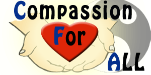
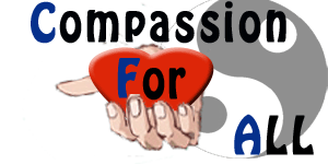
I have a website - www.compassionforall.blogspot.com
I can definitely use a logo.
I am thinking of a yin yang sign as a background, and from it, a cupped hand coming out with a heart in it. Can you design something like that?
Thanks,
Trang
Wow that was fast! Thanks for the WealthMountains design. Much better than my own one. :)
I have put up a link back to your site at http://www.wealthmountains.com/wealth/go/Blog/Blog.htm
Do let me know if you want to change the description. I can be contacted at http://www.wealthmountains.com/contractus.htm
Btw for my Wealthmountains Logo, may I request for the changes as follow:
- use the "Stronger" font for the words "Wealth" and "Mountains". By stronger, I mean thicker so that it gives it a solid feel. Currently, when I reduce the size of the logo to fit into my website, those words look thin.
- for the word "One Step at a time", can it be thinner? When I reduce the size to fit into my site, the current wordings become difficult to read. I like the way you design this wordings.
- after the above changes, can I request for 2 more versions in which:
1) The star (with the line) just above the words "One step at a time" be replaced with a raising SUN (to replace the star) and the color line of the line change to give the feel that the SUN is raising out of the horizon while the person climbing up to reach for the $. It gives it a feel that the user is having a fresh start.
2) For the $, would need your advice if another color besides blue is suitable for the theme.
Btw, my offer still stands. If you want to promote any of your other services/products, do let me know. I would be most glad to do it for free to my list since I had experienced the quality myself. :)
Best regards,
Keith Choy
Can you contact me please.
samfreedom2 AT gmail DOT com
Thanks,
Sam
Get a Free Logo
I love the logo you did for me at bobbi jo online. Do you think you could do one more? It's for my cooking blog.
The title is: Best Served Hot
The url is: http://thetexasgourmet.blogspot.com
thanks
bobbi jo
Wow, that was quick.
Can you design it so that the cupped hand is coming out ... as if, I am giving my heart to you. Thanks.
http://compassionforall.blogspot.com
Hey thanks. Looks great. I appreciate your work.
Hi,
What would you like for your logo?
Franco
I would love a new logo for "The Library Lady Rants" at www.libraryladymom.blog-city.com
There are descriptions of my family in the gutter of the site, and right now several photos of my family, if that helps.
Thanks!
I was thinking of two hands holding the heart instead of one. Also, I like the yellow tinge that emanates from the original version. Can you do that?
Thank you very much for your help.
The latest version was more of what I had in mind.
How would you want me to give you credit for your work? Just Franco?
Post a Comment